Seaborn - basic
seaborn을 이용해봅시다.
- 일반적으로 python에서 그림을 그릴 때,
matplotlib를 많이 이용합니다만,seaborn도 괜찮다고 합니다. 특히, 똑같은 그림을 그린다고 해도, 단순히 이 앞에import seaborn as sns만 덧붙여줘도 그림이 훨씬 예쁜게 나온다는 장점이 있습니다. 제가 그 차이를 밑에서 함께 소개해드릴게요. seaborn의 목적? 이라면, **matplotlib으로도 그릴 수 있는 그림을 더 간단하게(하나의 function만으로) 그릴 수 있도록 한다. **라고 말할 수 있겠네요.- 뿐만 아니라, plotting마다 조금씩 편한 부분들이 있어요.
matplotlib가 일반적으로 그림을 잘 그리기 위한 툴에 가깝다면,seaborn의 경우는 data exploration에 좀 더 특화되어 있다, 라고 말할 수 있을 것 같아요.
그러나.
- 예전에 제가 써 볼때는 유용한 부분이 많다고 생각했는데, 지금 다시 써보니까, 잘 모르겠습니다. 한 두가지 정도 빼고는 그다지 유용한 것 같지 않아요.
- 이미
matplotlib에서 비슷한 부분이 많기도 하고, 새로운 것에 익숙해지는 비용이 아깝기도 하고 matplotlib와 호환성 문제(figure, axes)등에서 “matplotlib에서는 되었는데 왜 안되지?” 라고 생각되는 것들이 꽤 있습니다. 그래서 저는 한 두가지 function만 외우고, 쓰지 않으려구요.
- 이미
- 오히려 다음에 matplotlib에서 그림 그리는 방법들을 다시 좀 정리해두겠습니다.
few image
sns.distplot
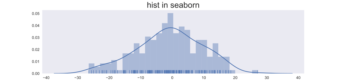
- data exploration 시에 가장 해당 data의 분포를 보기 위해서 histogram을 그려볼 일이 많다. 간단하게
plt.hist로 해도 되기는 하는데, 이 경우 bin의 개수를 어떻게 조절하느냐에 따라서, skewness 등을 파악하는 것이 어렵다. - 간단하게 kernel density function을 그림으로써 이 부분을 해결할 수 있는데,
sns.distplot에서는 kernel density function을 한번에 그려준다는 이점이 있음.
import pandas as pd
import numpy as np
import matplotlib.pyplot as plt
import seaborn as sns

lst = np.random.normal(0, 10, 200)

plt.figure(figsize=(12, 3))
plt.hist(lst, bins=30)
plt.title("hist in matplolib", fontsize='xx-large')
plt.savefig('../../assets/images/markdown_img/180604_not_applied_seaborn.svg')
plt.show()

plt.figure(figsize=(12, 3))
sns.distplot(lst, bins=30, rug=True)
plt.title("hist in seaborn", fontsize='xx-large')
plt.savefig('../../assets/images/markdown_img/180604_applied_seaborn.svg')
plt.show()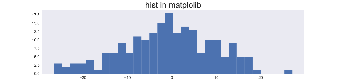
sns.jointplot
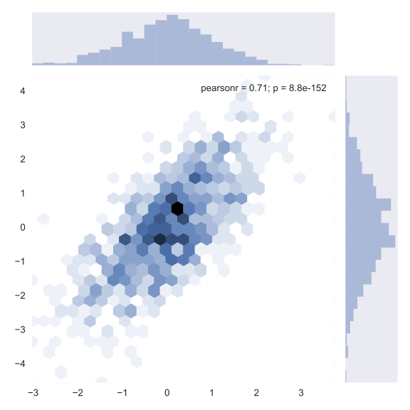
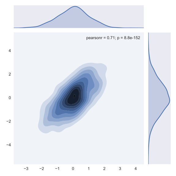
- 또한, 서로 다른 두 칼럽의 관련성을 파악하려면
plt.scatter도 괜찮지만, 개별 column의kernel density function과pearson_r값도 함께 그려주는sns.jointplot의 경우가 더 빠르고 편할 수 있음.
sample_size = 1000

X = np.random.normal(0, 1, sample_size)
Y = X + np.random.normal(0, 1, sample_size)

sns.jointplot(X, Y, marker='o', kind='reg')
plt.savefig("../../assets/images/markdown_img/180605_sns_jointplot_reg.svg")
plt.show()

sns.jointplot(X, Y, kind='hex')
plt.savefig("../../assets/images/markdown_img/180605_sns_jointplot_hex.svg")
plt.show()

sns.jointplot(X, Y, kind='kde')
plt.savefig("../../assets/images/markdown_img/180605_sns_jointplot_kde.svg")
plt.show()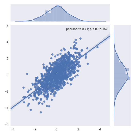
sns.pairplot
- 서로 다른 다양한 칼럼간의 관계를 파악하고 싶을 때는
sns.pairplot를 이용한다.
iris = sns.load_dataset("iris")
print(iris.head())
sns.pairplot(iris,
             hue='species',
             palette="husl",
             kind='reg',
             markers='+',
             diag_kws={'bins':20},
             plot_kws={}
            )
plt.savefig("../../assets/images/markdown_img/180604_pairplot_with_hue.svg")
plt.show()
sepal_length sepal_width petal_length petal_width species
0 5.1 3.5 1.4 0.2 setosa
1 4.9 3.0 1.4 0.2 setosa
2 4.7 3.2 1.3 0.2 setosa
3 4.6 3.1 1.5 0.2 setosa
4 5.0 3.6 1.4 0.2 setosa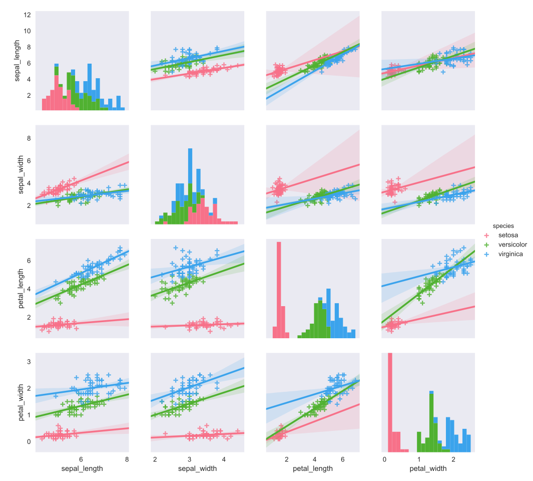
sns.heatmap
pd.DataFrame에서, column간의 correlation을 뽑아낸 다음, 이를 수치가 아니라, 색깔의 차이를 통해서 보고싶다면,sns.heatmap을 사용하는 것이 적합합니다.
import numpy as np
import matplotlib.pyplot as plt
import seaborn as sns

heatmap_df = pd.DataFrame(np.random.normal(0, 1, 100).reshape(10, 10),
                          columns=['col_{}'.format(i) for i in range(0, 10)],
                          index=['col_{}'.format(i) for i in range(0, 10)]
                         )

"""
- True인 경우, 표시되지 않고, False인 경우만 표시됨
- mask는 df의 형태로 넘길 수 있음.
"""
mask = heatmap_df.applymap(lambda x: True if abs(x)<1.0 else False)
print(mask)

plt.figure(figsize=(12, 10))
sns.heatmap(heatmap_df, annot=True,
            fmt=".1f",
            #cmap=plt.cm.Blues,
            mask=mask,
            cbar=True,
            linewidths=3)

plt.tick_params(labelsize=13)
plt.gca().xaxis.tick_top()
plt.xticks(rotation=45)
plt.yticks(rotation=0)

plt.savefig('../../assets/images/markdown_img/180605_heatmap_sns.svg')
plt.show()
col_0 col_1 col_2 col_3 col_4 col_5 col_6 col_7 col_8 col_9
col_0 True False True False True True False True False True
col_1 True True True True True False True True True True
col_2 True False False True False False True False True True
col_3 True True True True True False True True True True
col_4 True True True True False True True True False True
col_5 True True False False True True False False True True
col_6 True True False False False True True True True True
col_7 True True True True True True True True False True
col_8 True False False True False False True True True True
col_9 True True True True True True True True True False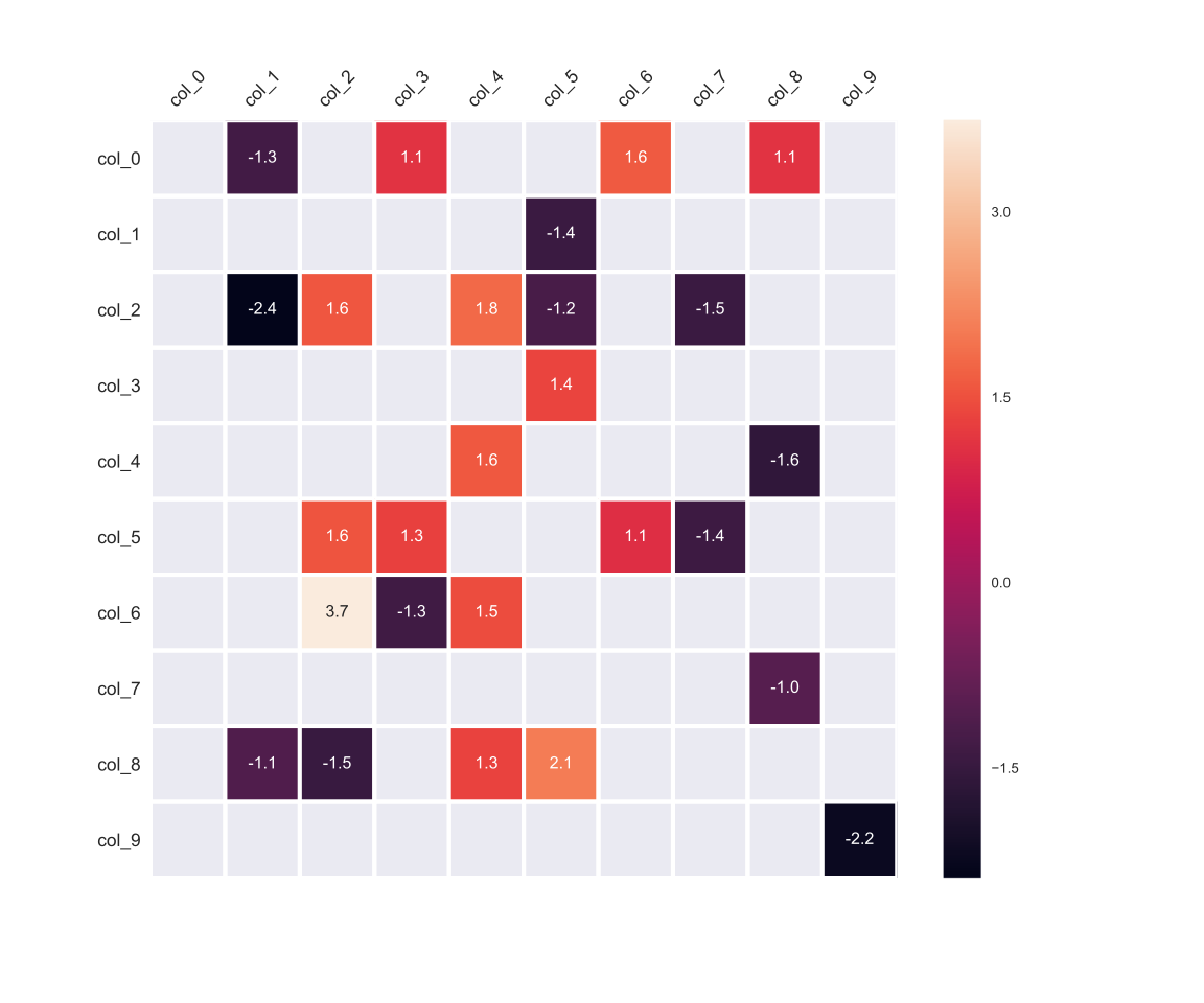
wrap-up
- 처음에는 괜찮은게 좀 많을줄 알았는데, 그냥 matplotlib를 기본으로 쓰고 필요할때, 몇 가지만 추가해서 써도 될것 같다.
reference
GitHub에서 이 글의 마크다운 원본 보기 & 수정 제안src/content/posts/2018-06-04-seaborn_quicksheet